Increasing content sharing
Mobile application
Problem:
Lack of engagement
Solution:
Increase visibility of features & highlight their value on the app
Results:
20% greater engagement with targeted featured
Company:
Havanote
Platform:
Mobile
Roles:
UX / UI designer
User researcher
Design process
What was delivered and how
Discover
- User interviews
- Competitive matrix
- Feature analysis
- Affinity map
Define
- User persona
- HMW statements
Design
- Team brainstorm
- Lofi wireframes & flow
- Hifi wireframes & flow
- Prototype
- User testing
New focus & Delivery
Iterative designing
User Testing
Prototype
Client presentation
Discover
Research Goal: Discover opportunities to increase engagement with Havanote’s note-sharing.
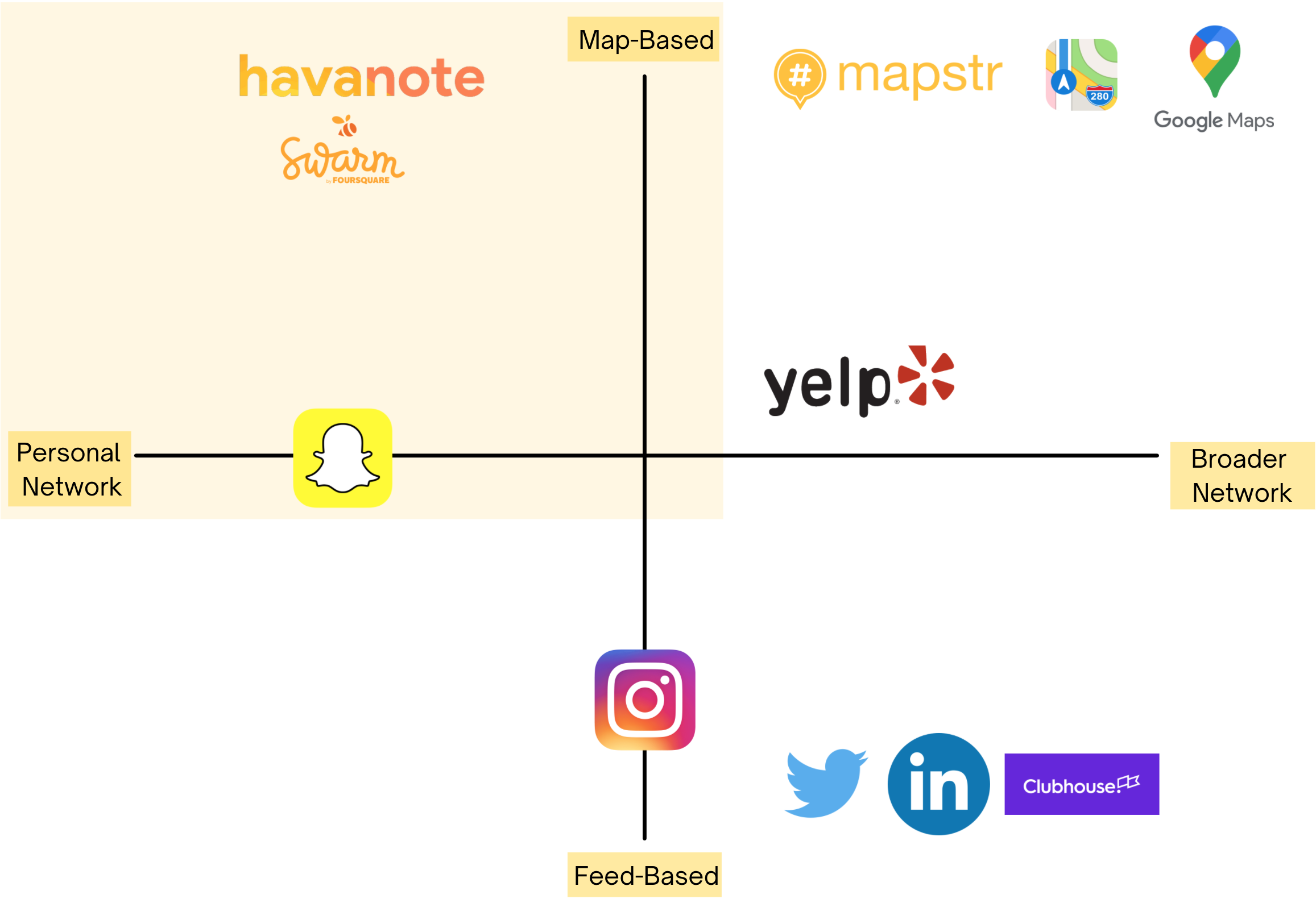
Competitive Matrix
Insights:
- Havanote lives in a unique niche.
- Plenty of opportunity to increase engagement given its niche.
For all of the team members, Havanote was a unique app whose primary functionality of leaving ‘digital stickies’ at geotagged locations was a bit foreign to us. In order to get a better sense of the app’s identity, we created a competitive matrix. This also helped us to identify trends in our competitors as well as opportunities to stand out.
We design our matrix with vertical oppositions being map-based content delivery vs. feed style content delivery, and on the hortical oppositions focusing on whether an app is leverages a more personal or broader network (a network created by and accessed on the application.)
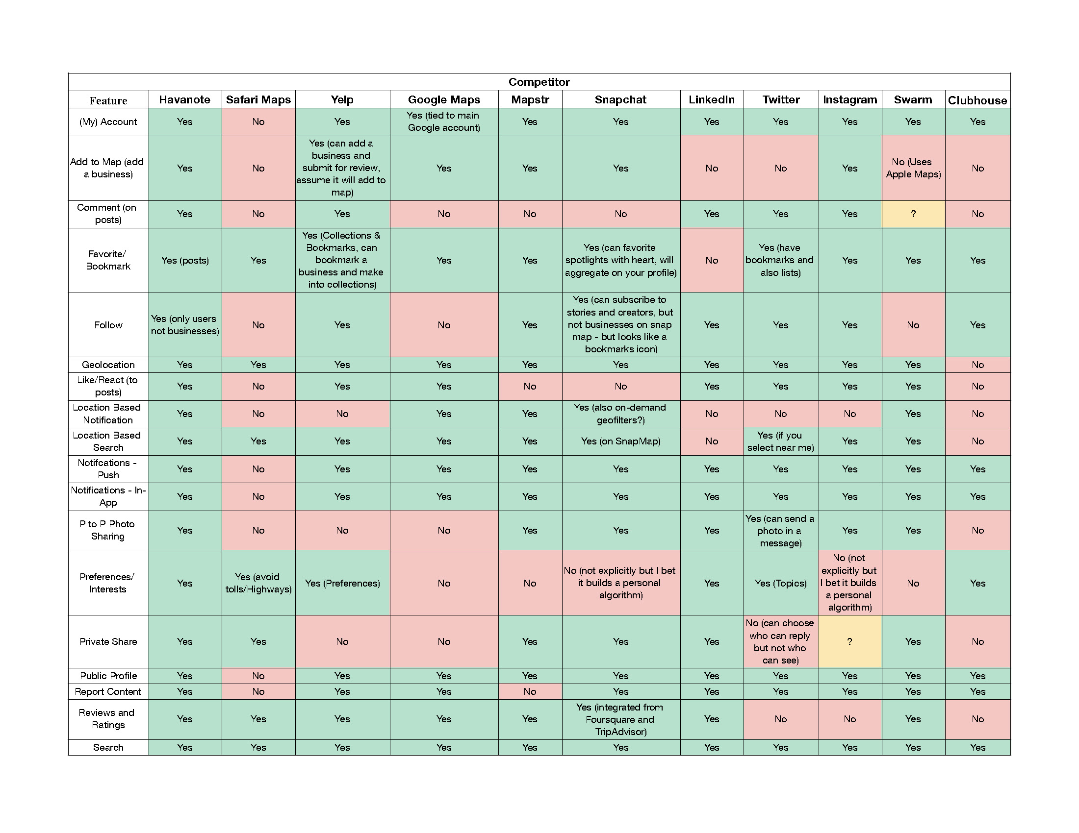
Feature Analysis
Insights:
Competitors generally:
- Incorporate experts from a broader network to add credibility
- Have built-out business pages with integrated functionality (ie. bookings)
- Have a status or rewards program
The team identified and assessed key competitors and created an in depth feature analysis that would help us in determining which features could provide critical opportunities to increase engagement, that Havanote might be missing.
What we found interesting during this exercise was that Havanotes competitors revealed many forms of functionality to increase engagement with the notes features. Opportunities such as incorporating experts from a broader network, built-out business pages, and creating a rewards or status program became attractive solutions to increase engagment with the notes feature.
User Research
Goal: Discover pain points, behaviors, goals, and needs of users on the topic of note-sharing engagement.
Our user interview participants were recruited from a volunteer pool of current Havanote users, of which 5 which were selected. Wanting to gain greater insight into our users our team also sent out a survey which received 3 responses. Using these methods we developed an understanding of our users, which allowed us to identify specific opportunities to improve engagement. The team also took into consideration the alignment of user feedback to our preliminary solutions found in the feature analysis.
Insights:
- Restaurants are the Major User Focus
- Social Validation is key
- Filtering Content is a Pain Point and Opportunity
“I like Havanote for getting notification about places or restaurants or where people have visited, so you get to see what they wrote about the place or the restaurant.”
-User
“I use Havanote when I need to go to a store and have a to do list or a reminder when I get to a location.”
-User
“I downloaded Havanote because I like to see which restaurants my friends have been too. I will often pick a restaurant from a fellow users note.”
-User
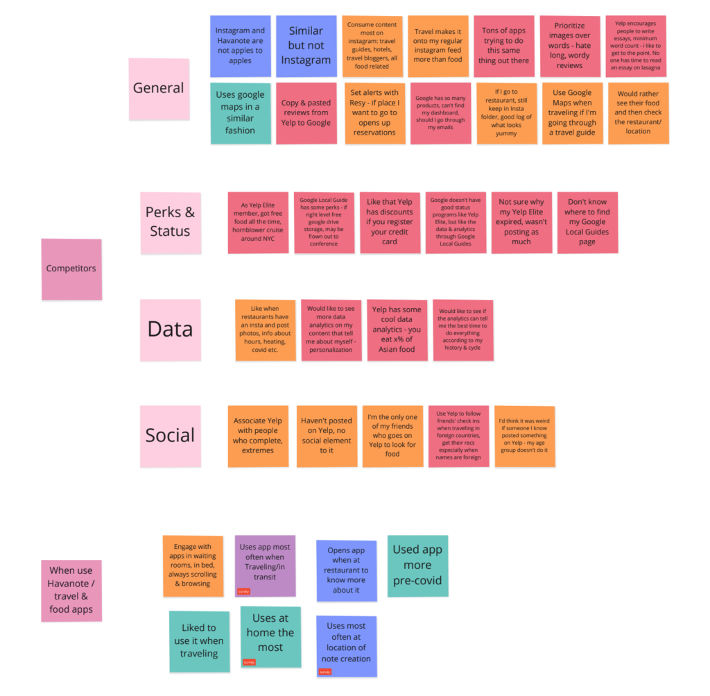
Affinity Map
Insights:
- Recommendations are main drivers of engagement
- User credibility is important
Users will create content more than engage with others content
Using synthesized data points gleaned from our user interviews and surveys, we organized our findings into an affinity map. By creating an affinity map the team was able to identify and align on key user trends, themes, and insights. This information would help us in building our user persona and help to identify and prioritize opportunities to improve engagement.
Persona
Insight: Developing the persona redefined how havanote saw their users, eliminating key presumptions and gaining a greater understanding of engagement pain points.
During our initial conversation with Havanote they consistently referred to their ‘users’ based off their ideal marketing persona, rather than a UX persona based in research. In order to address this disconnect, we leveraged our user interviews and synthesized data from our affinity map into a User Persona. This persona allowed the team to more accurately define the user base, as well as allowing our team to speak to a user and design solutions for that user.

Foodie Frank
Frank is a young urban professional who enjoys the local restaurant scene and discovering cool new places. Frank typically finds new restaurants and venues by asking friends and leveraging social media. He wants a way he can quickly and easily access food recommendations.
Goals
Get the inside scoop on his local area and restaurants
Plan for future trips
Needs
To understand credibility of recommendations when he’s researching
To feel social validation from his posts
Pain Points
Restaurant recommendations on social media sites not geotagged or easy to find
Wants more social recognition when he posts about his food
Needs a better way to filter through content he’s posted
Define
Defining opportunities for solutions
Problem Statement
Users currently have low engagement with Havanote because they need a clear and focused user path based on their main goals in the app and more social validation while using the app.
How Might We...
How might we focus the user around their main goal early on so they stay more consistently engaged with the app?
How might we create opportunities for the user to feel more social validation while they engage with the app?
How might we ensure that the content in Havanote is credible and thus most useful and attractive to users?
Design
Goal: Ideate and design solutions for our Problem and HMW statements
Design Studio: Sketching & Concepting
Design assumptions:
- Create note categories & filter
- Create Business page
- Improve note search
- Add notifications
Considering our research and assessing our opportunities, we focused our design efforts on revamping the homepage, enhancing search functionality, creating a business page, and designing a new notification feature. To address these areas we first conducted a group brainstorm session to ideate solutions, then mapped out proposed functionality with Lo-Fi wireframes.
At this stage we focused on a volume of possible solutions by iterating quickly with Lo-Fi wireframes and wireflows since we knew that there was an existing style guide in figma. This would allow us later quickly and effectively to move to hi-fi assets.
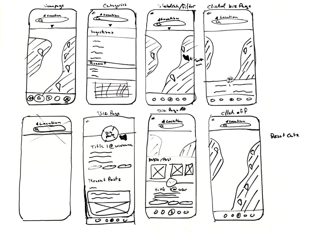
Ideation Sketches
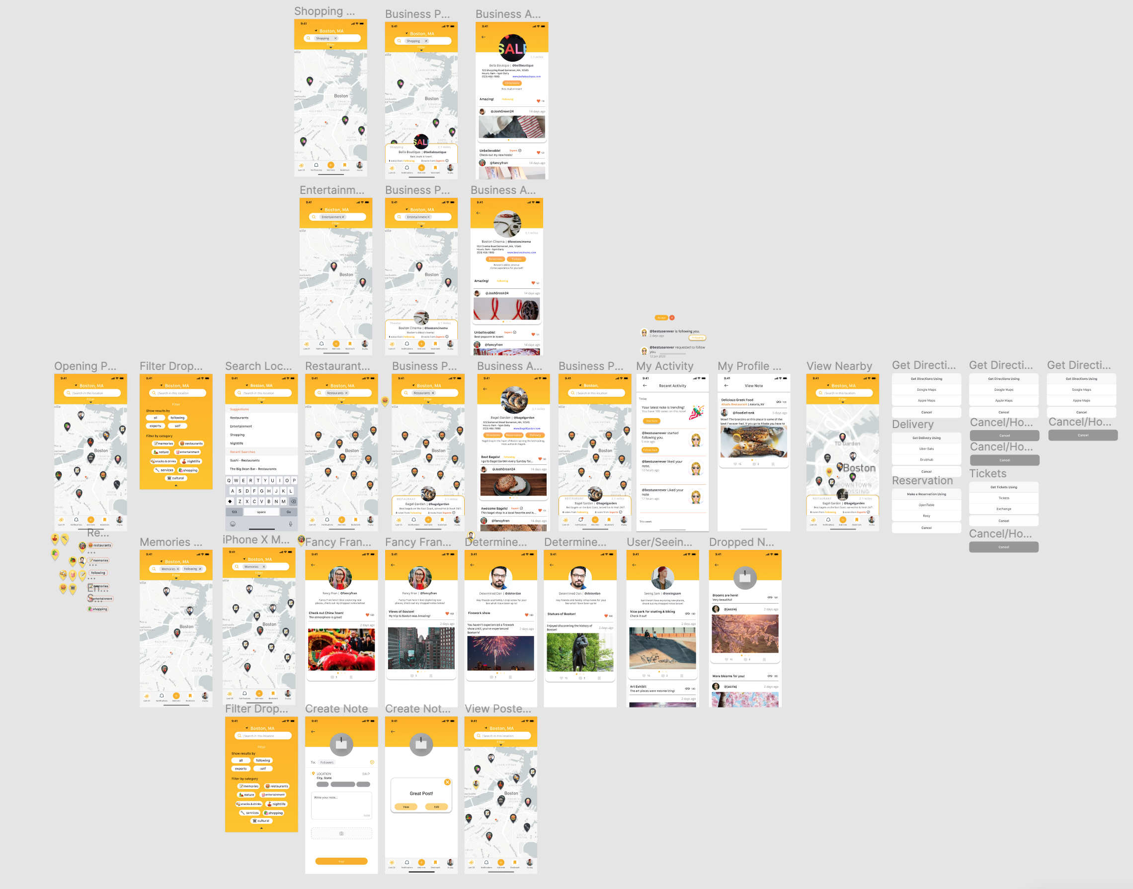
High-fidelity
Insight: Given the existing design library our preliminary design iterations fit well, within Havanote’s existing framework & functionalities.
Having access to Havanote’s existing design library we were able to move quickly to high-fidelity wireframes. The team used our Lo-Fi mockups as an outline to quickly iterate a high-fidelity wireframes, wireflow, and V1 Prototype.
At this stage the team was able to more accurately articulate our preliminary designs for revamping the Homepage, enhancing search functionality, creating a Business Page, and designing a new notification feature.
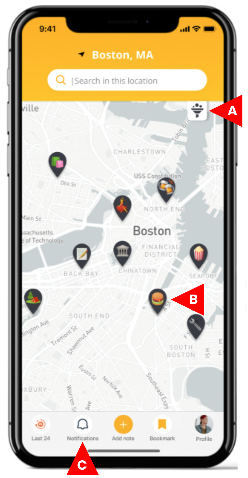
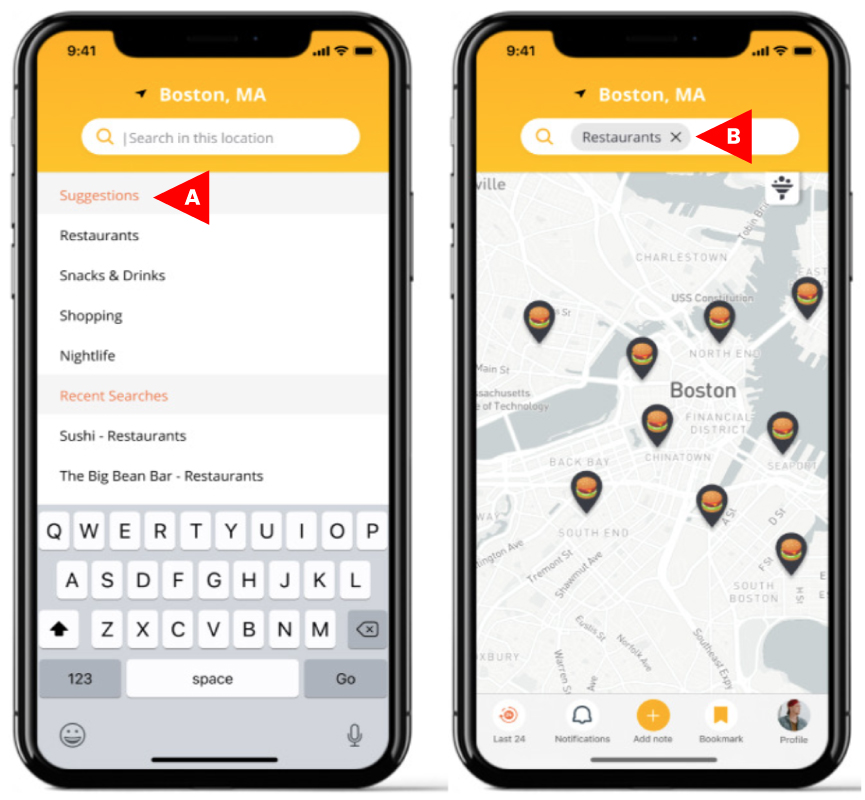
Homepage
How might we focus the user around their main goal early on so they stay more consistently engaged with the app?
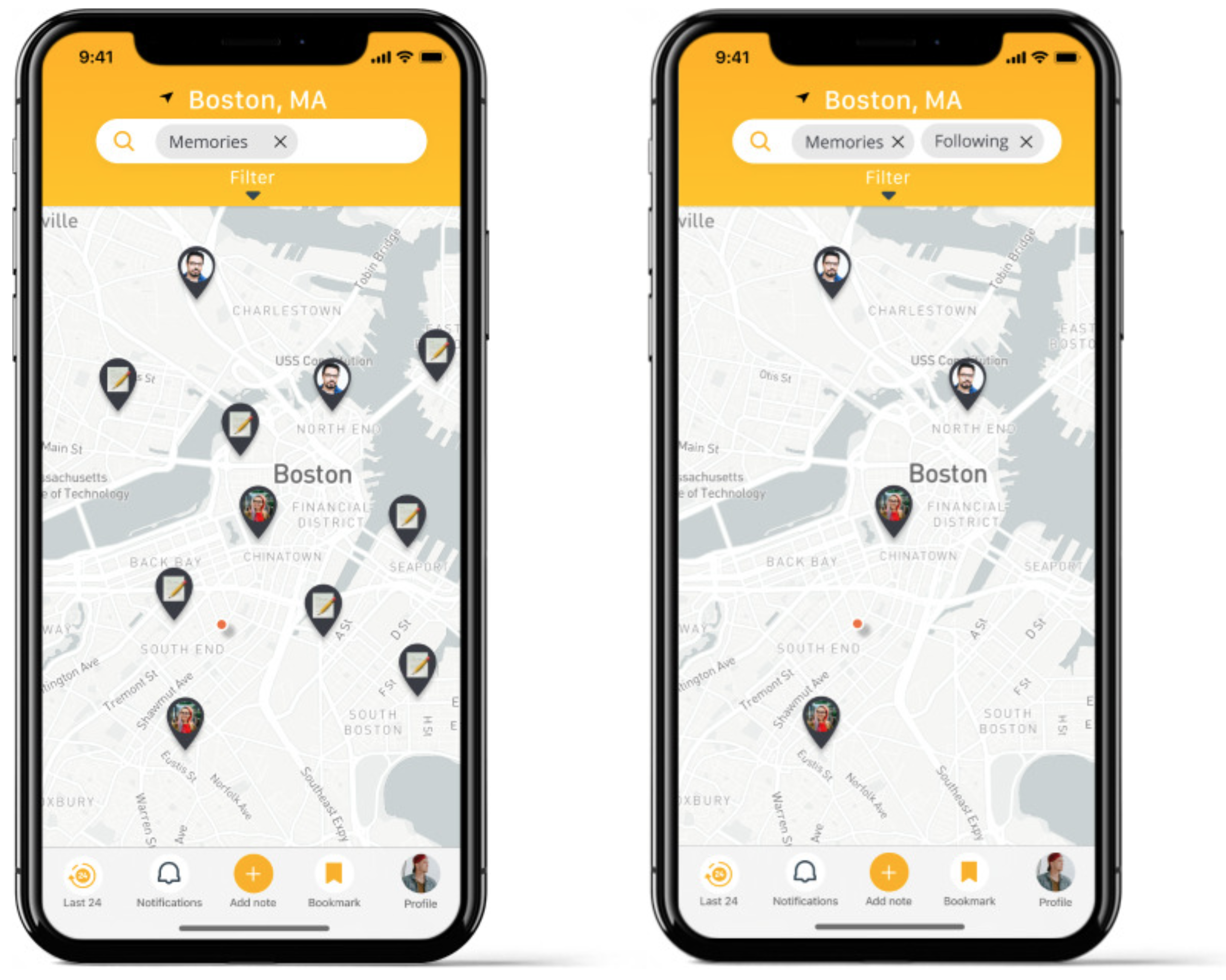
A. Changed user photos representing notes to pins with emojis representing categories of locations
B. Pins with categories bring instant recognition to what users are looking at and how to engage with them
C. Brought notifications (formerly activity) onto bottom navigation to prioritize user engagement and social validation
D. Added ability to filter map with categories
Search
How might we focus the user around their main goal early on so they stay more consistently engaged with the app?
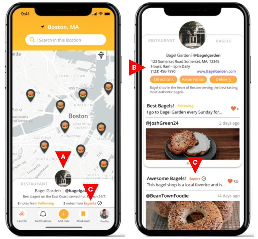
Business Page
How might we focus the user around their main goal early on so they stay more consistently engaged with the app?
How might we create opportunities for the user to feel more social validation while they engage with the app?
A. Created built-out business pages because users wanted more information about the businesses they were evaluating
B. Added information consistent across competitors: website links, contact info and integrated capability like reservations and delivery
C. Added distinction between Followers & Experts for credibility
Notifications
How might we ensure that the content in Havanote is credible and thus most useful and attractive to users?
How might we focus the user around their main goal early on so they stay more consistently engaged with the app?
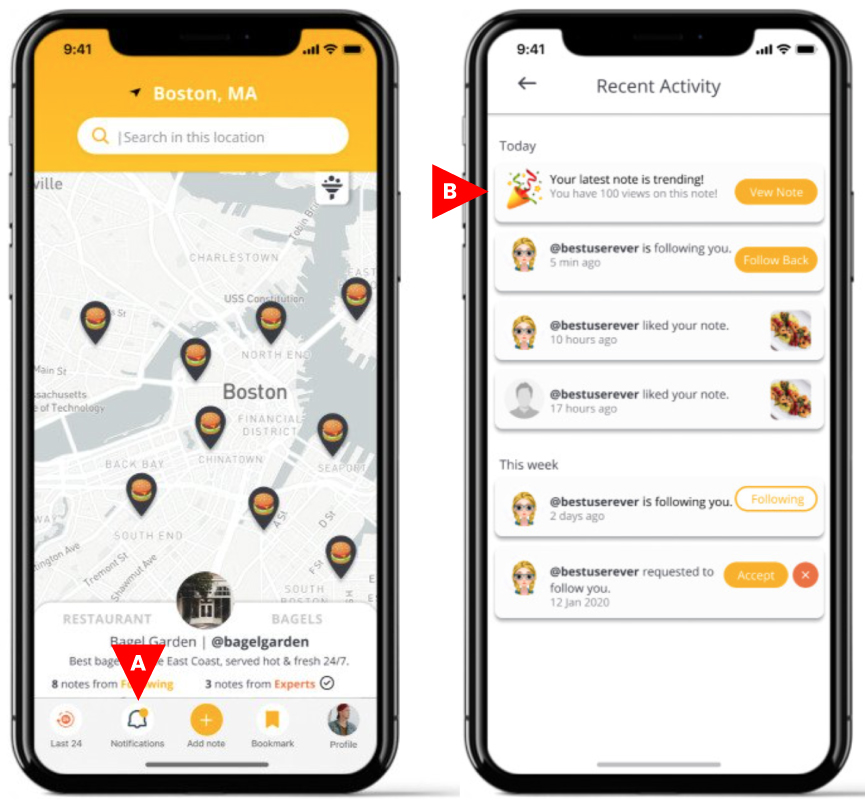
Initial User Testing: First Round
Testing for:
- Concept validation
- Navigation
- Credibility
- Social validation
For our first round of user testing we were able to recruit 4 users to participate, which was conducted remotely over zoom. During this round of testing we encountered plenty of useful insights and feedback on our first prototype iteration.
Results:
Homepage
- 4/4 users noticed the pins first on the home screen and remarked on the emojis
- 0/4 users used the filter feature to search
- 3/4 users did not mention seeing the filter feature
“I like how with little emoji pin you can guess exactly what category the thing will be in.”
Search
- 4/4 users went straight to the search bar to complete their task
- 4/4 users used search suggestions to successfully to search for restaurants
“See suggestions categories. Seems like it’s getting me in the direction I want to go in.”
Business Page
- 4/4 users wanted more business information beyond the short page
- 3/4 users got to the expanded business page
- 3/4 users clicked to make a reservation
“Cool, I can make a reservation!”
Notifications
- 2/4 users didn’t click notifications – current user
- 2/4 users went straight to notifications – target user
- Target users were split on liking views & trending metric and deprioritizing it
“I go first to things connected with people I know, last to things that seem like promotion from the app.”
User Test Insights
- Filter needs to be redesigned
- Integrate business page
- Make notification functionality more accessible
- Integrate emojis
- Integrate search functionality
Emoji pins on the map
- 4/4 users liked
New reservation action
- 3/4 users liked
- 4/4 users liked credibility of OpenTable integration
Features Requested
- 3/4 users See distance from where they are –
- See restaurant menu – 2/4 users
- Dot showing where you are on the map – 2/4 users
- Restaurant rating ie star rating – 2/4 users
- 4/4 Users failed to find the filter functionalities
- Users struggled to find the notification functionality
New Focus
A new focus based on client feedback & user feedback based on our first design
What Havanote said...
Client Take-away: Develop a new ‘Map your Memories’ functionality and increase discoverability of notes.
- Like the new pins with emojis because tells you more about the contents of a note than just the person who created it
- Like aggregating notes to a point of interest or business because if many people post about a museum, you’ll see 1 pin on the map vs 100 individual notes, and reducing the number of pins on the screen makes it easier to focus on what to look at
- Not eager to add too many business-focused features, don’t want to look too much like Yelp / other competitors
- Want to avoid more 3rd party integration, open to building database for business profiles
What we planned
Next Steps: Increase discoverability of notes and workshop ideas for ‘Map your Memories.’
Taking into consideration Havanote’s feedback from our first Prototype and Testing, our team focused on integrating on our previous successes with a new focus mandated by the client. This new focus was on the functionality of Mapping your Memories, & Increasing discoverability of content from the first prototype. As a team we drew on our previous user interviews and testings to ideate solutions to best address the client’s needs.
Design Iteration: First Round
Goal: Develop new solutions for discoverability & ‘Map your Memories based off user interviews.
With a new focus on increasing the discoverability of the notes and building the functionality of ‘Map your Memories’ feature the team brainstormed solutions to these issues. Leveraging insights gleaned from from our first round interviews we developed we incorped that feedback into our designs.
Map your Memories
- Want to make it possible for users to leave memories that aren’t tied to a point of interest or business
- Want to make Havanote feels user-centric, gratification from seeing people they know
- See Havanote’s long-term vision as a place where people can share and discover other people’s memories
Discoverability
- With these new pages, how would content be discoverable if it’s not at the end of a targeted search?
- Want to guide users to expand their idea of how to explore their surroundings, surprise and delight them by introducing them to new things they weren’t necessarily looking for
Final Prototype
Built in Figma this prototype walkthrough demonstrates our functionality for:
- Filtering searches
- Business pages
- Note discoverability
- Mapping your memories
- Notifications
Final User Testing
Goal:
- Validate design assumptions from fous shift and
- Gain actionable insights for future iterations.
- Provide insights in delivery
Our final round of user tests yielded valuable user feedback that provided insights and concept validation for the conclusion of this project. Research at this stage was focused on concept validation of newly proposed functionality; as well as user insights which would give Havanote actionable information for future iterations. Using these metrics we presented our findings to Havanote and provided a roadmap and recommendations for future iterations.
User Insight
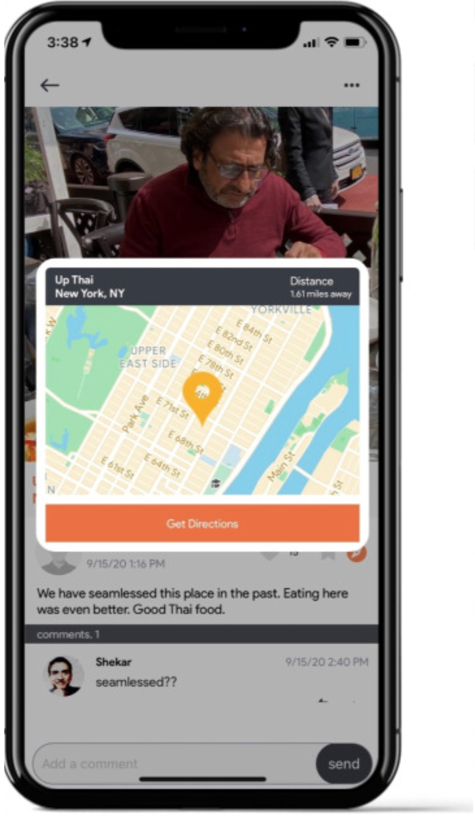
“Does this give directions? While traveling, I would have saved places for my trip. Say I wanted to go from Bagel Garden to Boston Public Library, if I had to switch to Google Maps to get directions between them, might just use the pinpoints in Google Maps already and not go back to this.“
-User
Concept Validation
“Felt the app was pretty intuitive. It combined some of the visuals and functionality of apps I’ve used in past – Google Maps and Yelp for the map feature and Instagram with likes, comments and notifications. It’s a system I’m already familiar with so I found it easy to use.”
-User
Concept Validation
“I don’t use apps to find historical things I want to do when traveling. I use desktop research for big landmarks to hit. For what to do in Maui for 7 days, I read blogs and travel itineraries I find on Google on my computer. When opening an app, I’m thinking of food, maybe shopping. I only open apps to figure out restaurants, reservations and sometimes hotel and flights.”
-User
Delivery
Recommendations
- Expert – establish what this title means and what someone would need to do to get this kind of status
- Overall Rating -add an overall rating system to notes might help.
- Bookmark – users should be able to bookmark a point of interest
- Itinerary Building – develop functionality to build and save itineraries
Implementations
Features add to Havanote’s roadmap.
- Emojis as Pins
- Discoverability
- Map your Memories
- Notification Page
Next Steps
- Filter Feature – continue to test why users aren’t finding it
- Emojis – test emoji categories to for proper association