Managing daily flight operations

Product design

Problem:

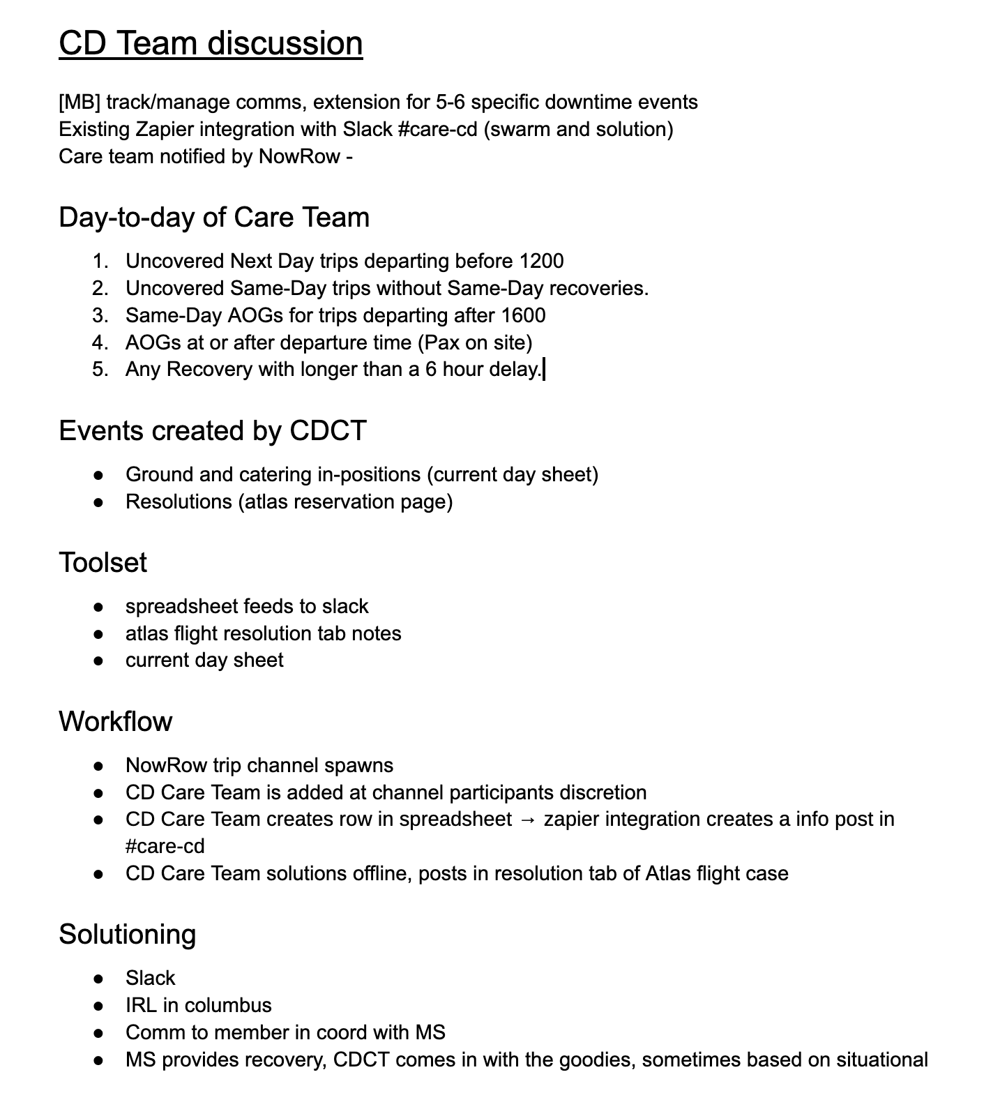
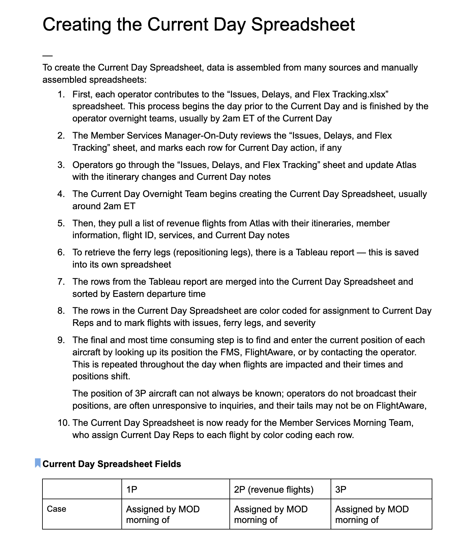
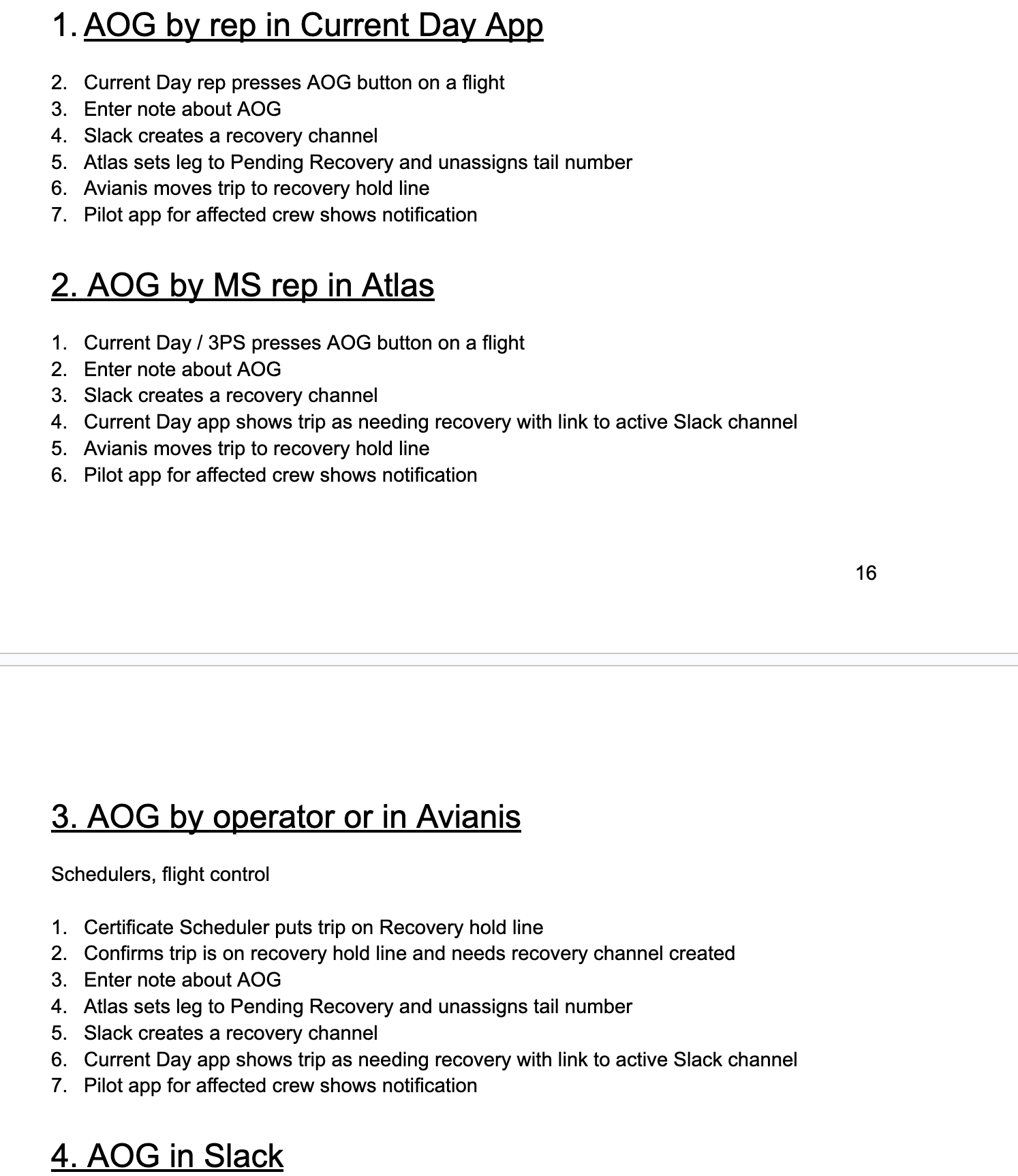
The Member Services Current Day Team manages daily flight issues using a time-consuming spreadsheet process that is difficult to measure and track.

Solution:

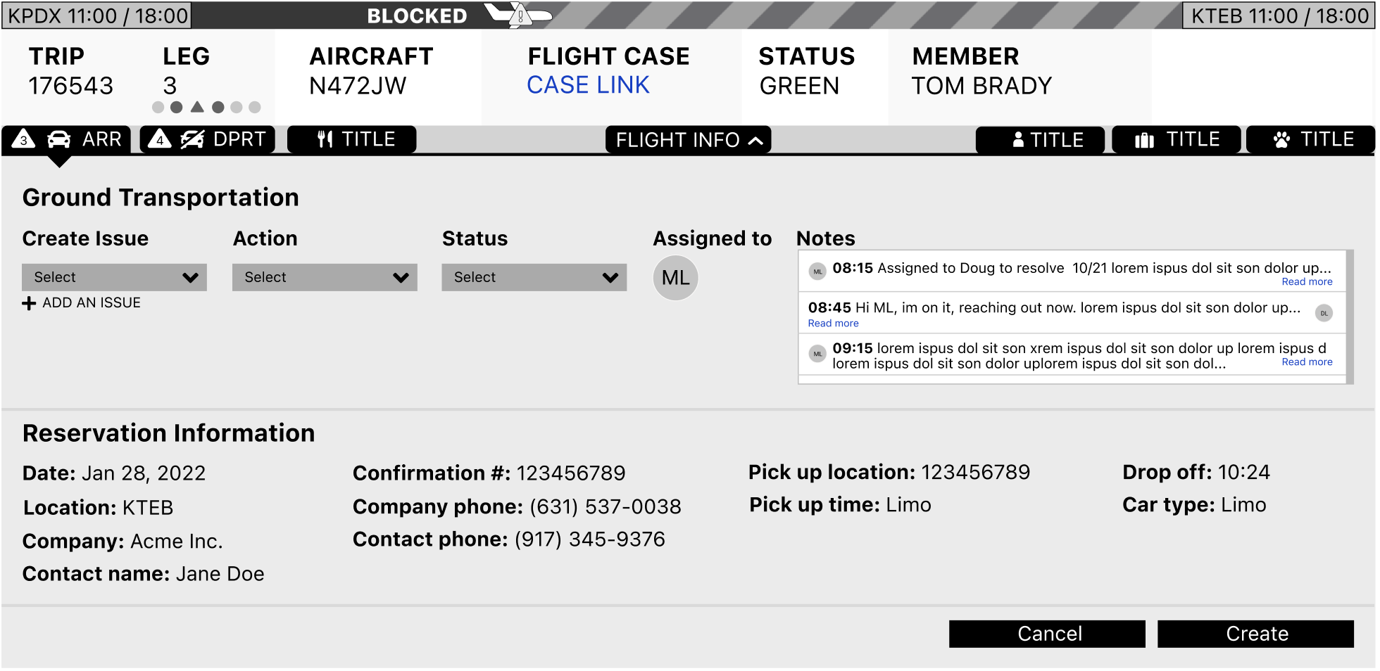
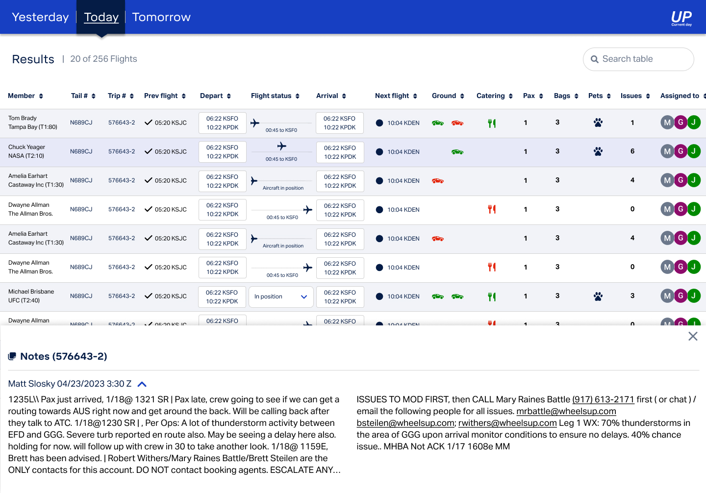
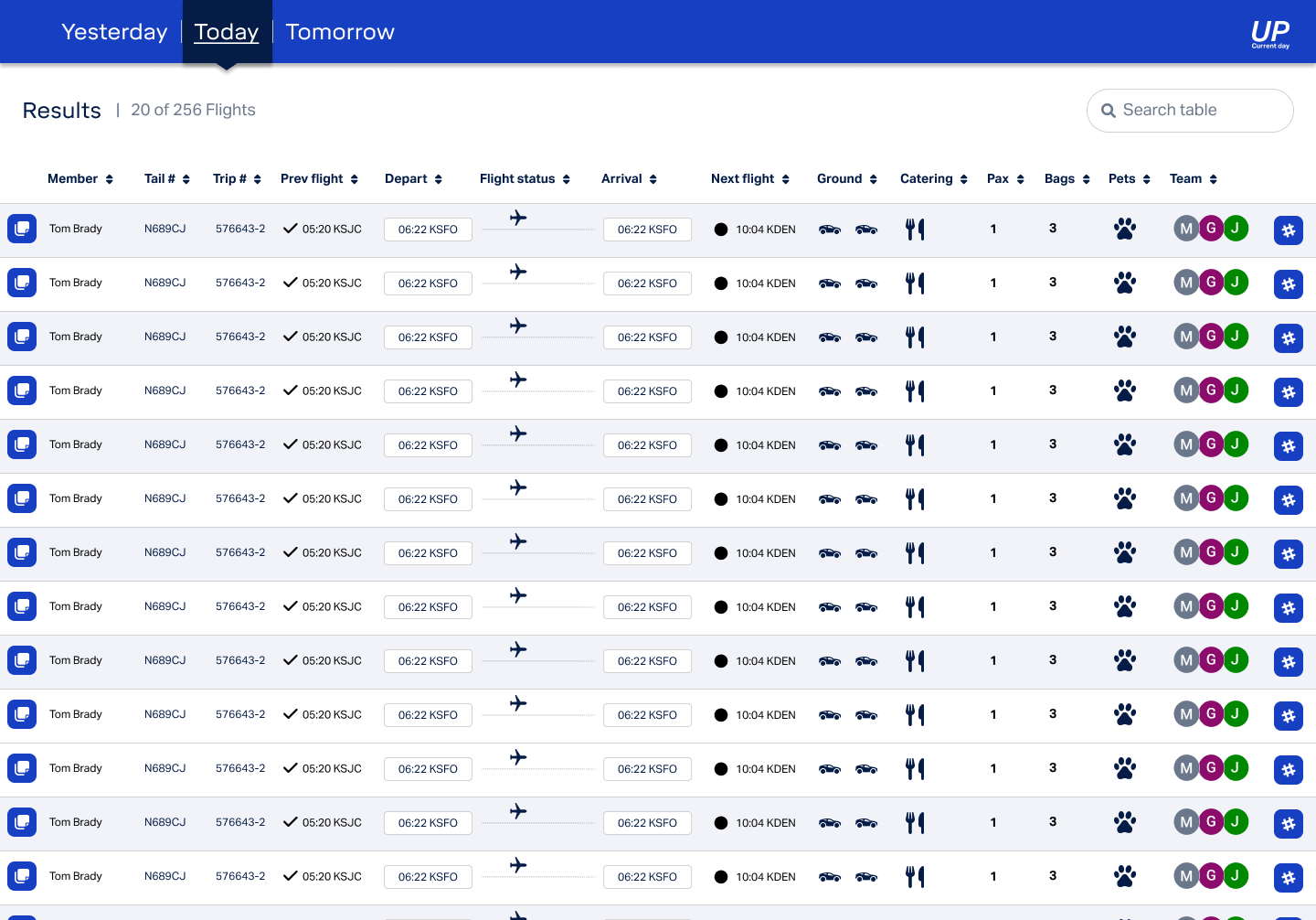
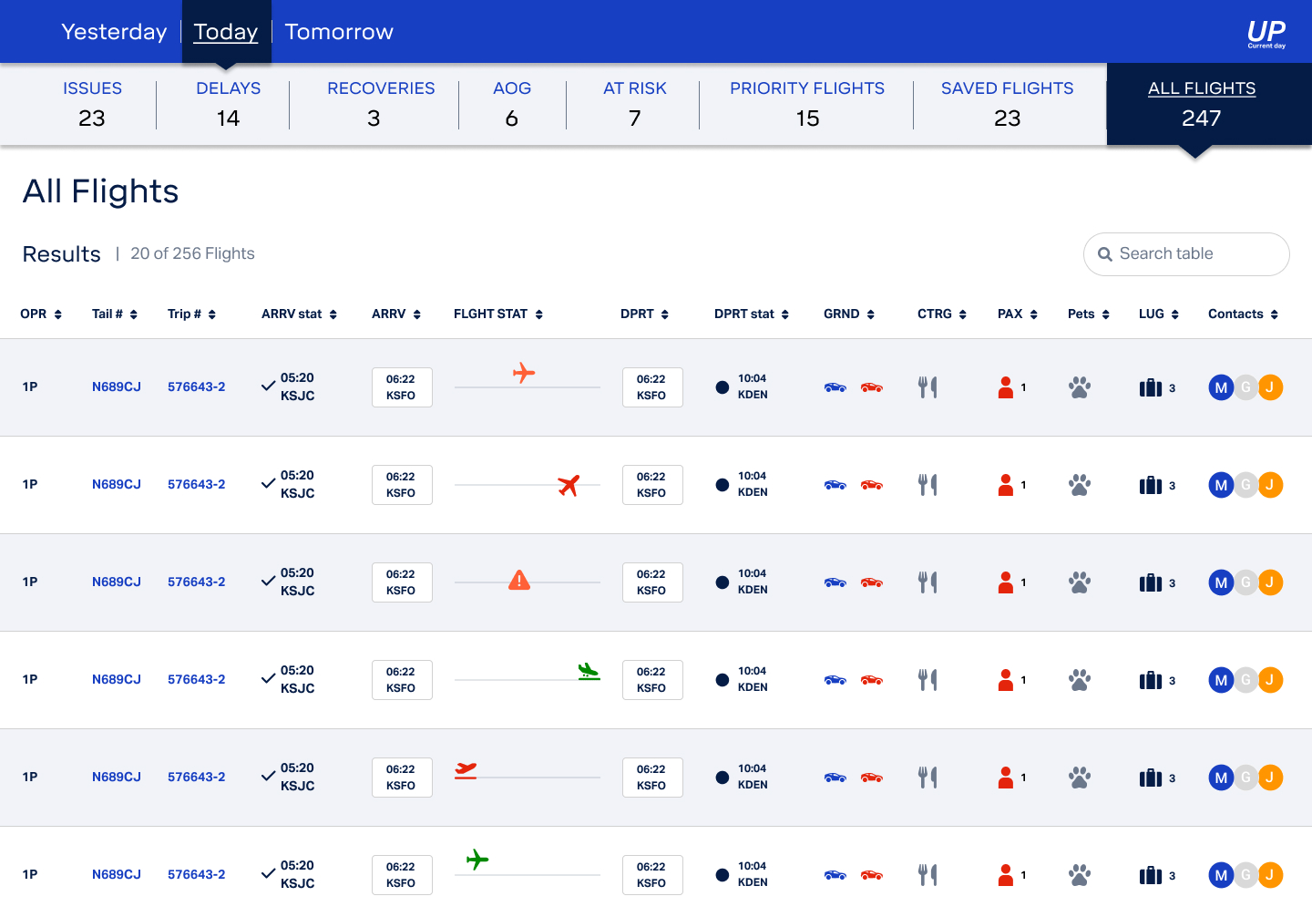
Build a Current Day Application for assigning team members to flights, managing Flight Cases, and handling flight issues, delays, and disruptions across operational systems and communication channels.

Results:

In production

Company:

Wheels Up

Platform:

Desktop

New product

Roles:

UX / UI designer

User researcher

Design process

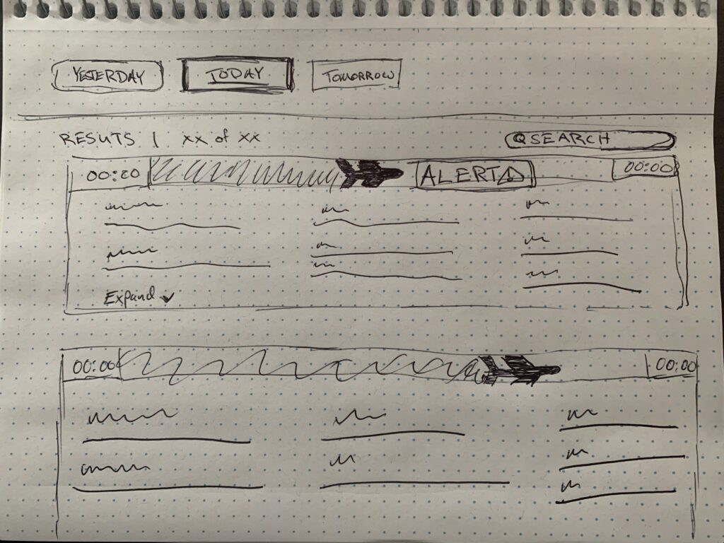
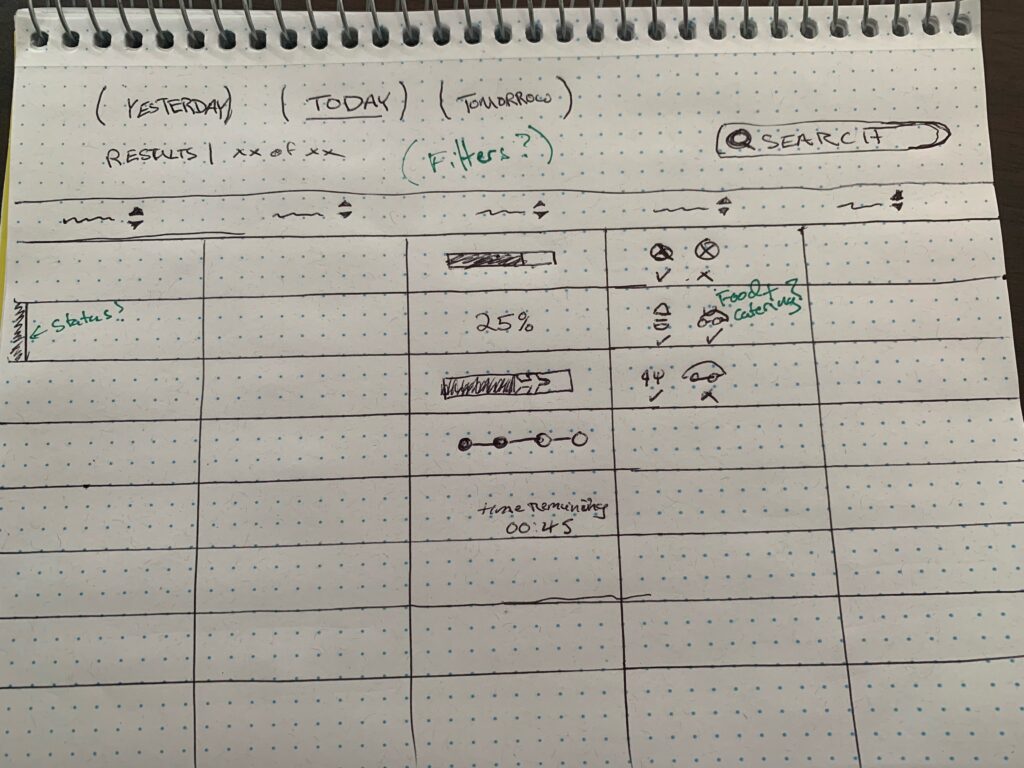
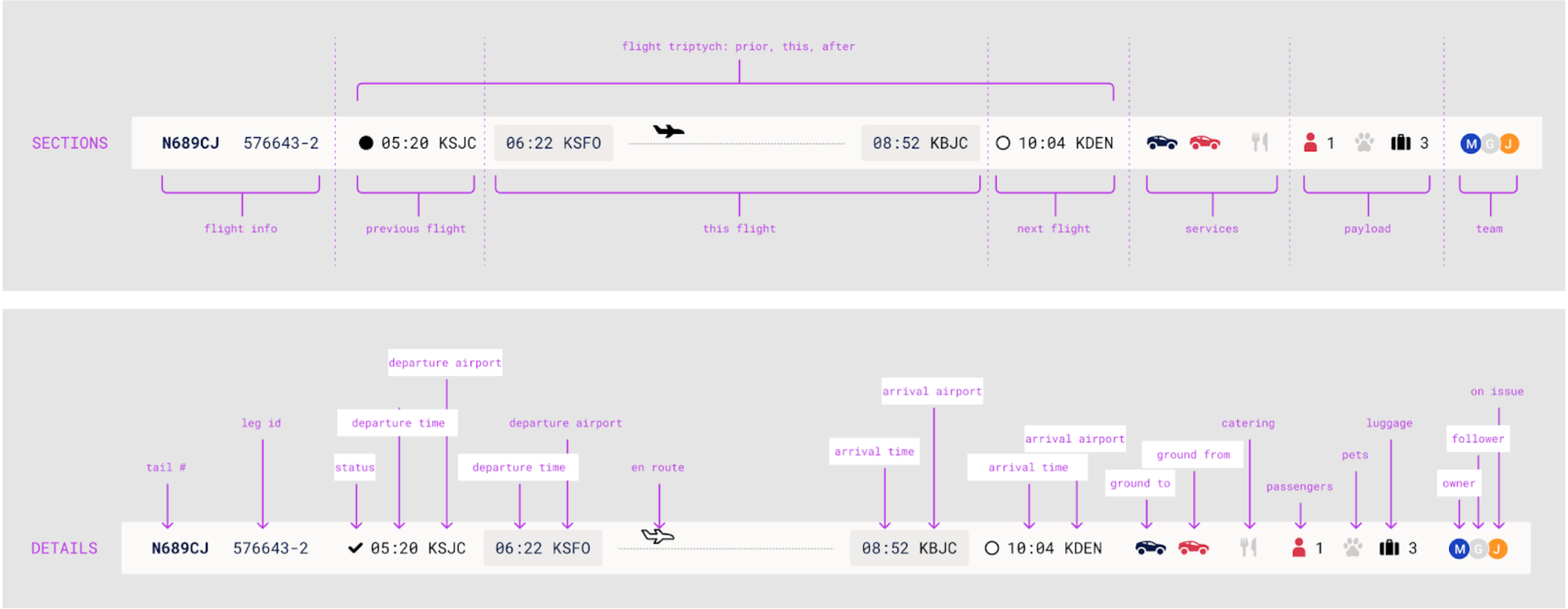
What was delivered and how

1 / 4

Discover

  • User interviews
  • System evaluation
  • Design thinking team exercises

Define

  • User persona
  • Task analysis
  • HMW statements

Design

  • High fidelity mockups
  • Prototype

Deliver

  • In production

Discover

2 / 4

Understanding the problem

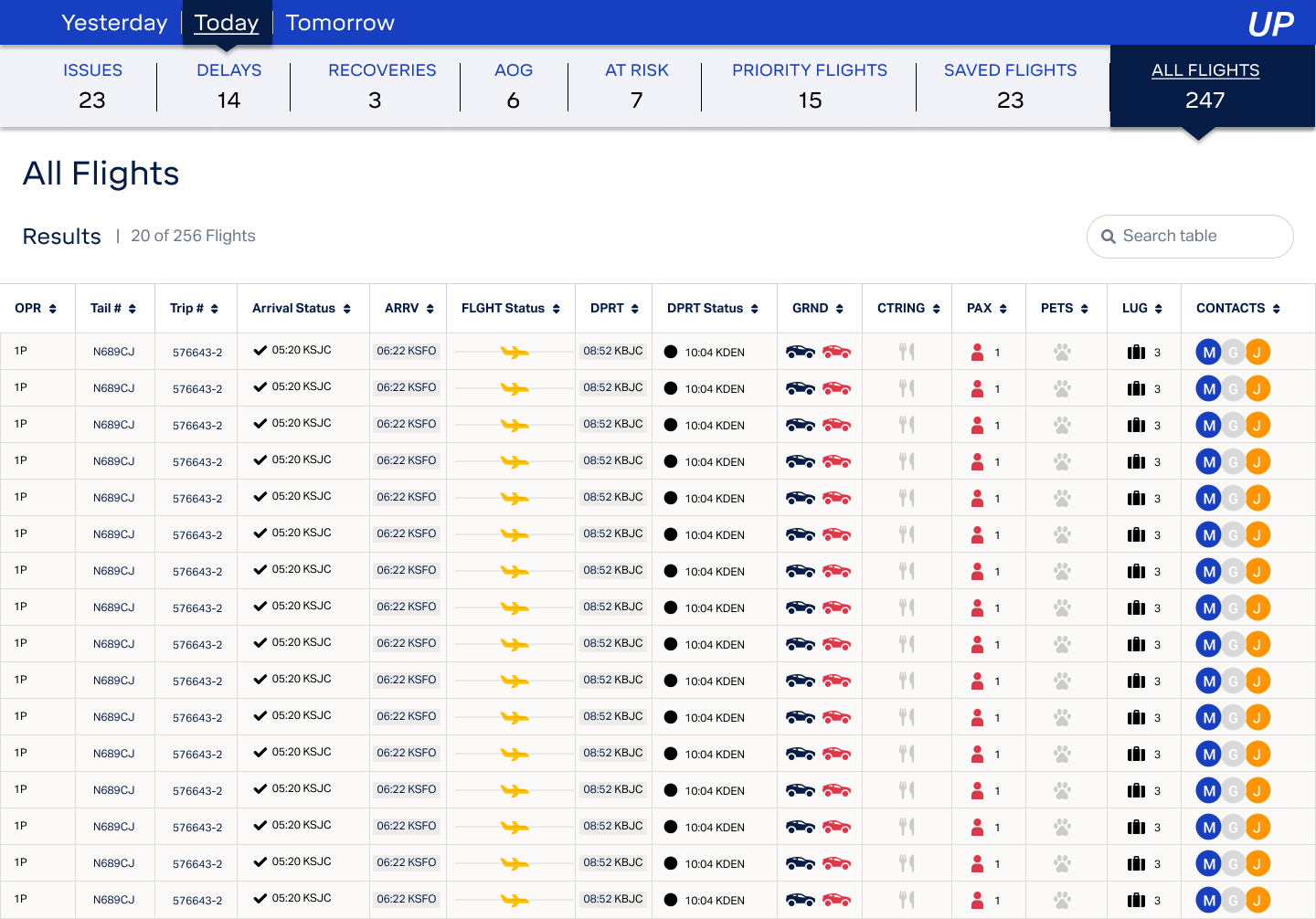
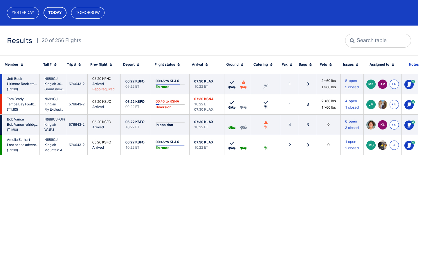
Managing 250 flights daily, we're bogged down by a cumbersome spreadsheet process for 3-4 hours, struggling to track and resolve 60 significant issues, 10% of which linger. With reps juggling 20 flights and peak issues from 10 AM to 3 PM ET, it's clear: to keep pace with rising flight volumes, WUP must streamline and automate our processes for better productivity.

What our users are saying...

Robin

Operations manager

It often feels like we’re drowning in data. I wish there was a way to filter out the noise and focus only on what’s truly important for our daily operations.”

Tiffany

Operations coordinator

“Navigating between different systems is frustrating. I spend more time trying to locate information than actually acting on it.”

Carly

Operations coordinator

“Sometimes, the most critical alerts get lost amidst the countless notifications I receive. It’s challenging to prioritize when everything seems urgent.”

Challenges

  • Data Density: With real-time data on flights, there might be a plethora of information to display.


  • Slow Navigation: In a high-stakes environment like flight operations, users need to quickly navigate to critical sections.


  • Lack of Feedback Mechanisms: To enable swift responses, the design should provide clear feedback on tasks completed or any errors that might arise. 

Goals

  • Enhanced Decision-making: Create an intuitive and real-time interface that presents flight data and potential issues in a structured manner
  • User-Centric Design: Design a platform that caters to the varied tech proficiency levels of the operations team.
  • Efficient Problem Identification: Develop a system that not only highlights real-time flight data but also proactively identifies and categorizes potential challenges

Define

3 / 4

Staying on target with a user persona

Alex in Ops

The persona, named “Alex,” represents a seasoned operations team member who often juggles multiple tasks simultaneously, seeks efficient integration between systems, and craves a streamlined interface to quickly identify and address flight-related challenges without being overwhelmed by excessive data.

Behaviors

  • Primarily uses desktop
  • Uses multiple platforms in concert
  • Email and phone user
  • Tasks logged after communications 

Needs

  • Platform integration
  • Data Prioritization
  • User friendly interface
  • Adapatible workflow to flight contingencies

Pain Points

  • Overwhelming data
  • Systems fragmentation
  • Poor communications
  • Poor task based alerts

Goals

  • All WUP flight stats on a single interface
  • Live actionable data on all WUP flights
  • See yesterday, today, and tomorrow flights

Task analysis

Insights

  • Inconsistencies in User Experience
  • Critical Decision Bottlenecks
  • Opportunities for Proactive Alerts

Features

  • Unified User Experience
  • Priority Data Dashboard
  • Adaptive Alert System
  • Decision Support Tools
  • Guided Workflows

Defining the issues

Problem statement

The Wheel Up operations team struggles with fragmented systems and information overload, necessitating a unified solution that seamlessly integrates real-time flight data, prioritizes urgent issues, and tailors to the diverse roles, ensuring rapid, informed decisions.

How might we...

  • How might we design an interface that consolidates fragmented systems into a unified experience, enhancing the efficiency of accessing real-time flight data?
  • How might we implement smart prioritization techniques to sift through vast amounts of information, ensuring urgent issues are promptly highlighted and addressed?
  • How might we tailor the platform to cater to the diverse roles within the Wheel Up operations team, ensuring each user feels equipped and empowered in their specific tasks?

Design

How can we design an interface that consolidates fragmented systems, prioritizes real-time flight data, and empowers diverse roles in the Wheel Up operations team?
3 / 4

Sketching & Concepting

During the design process, we began with rough sketching to map out the basic structure and layout, allowing for quick ideation and iteration.
As the design's direction solidified, we transitioned to high-fidelity mock-ups, leveraging the existing design system.

Mid-fidelity Wireframes​

Mockups using grayscale and basic shapes, clarified the layout, hierarchy, and functionality, facilitating feedback and iteration before moving to high-fidelity design, ensuring alignment with user needs and project goals.
Our critical takeaway from this was was that information should be delivered in table format due to large data sets, and legacy user behavior from previous systems.

Reviewing wireframes with ops team​​

During a collaborative session with 8 members operations team, we presented our initial wireframes to gather firsthand feedback.
Their insights were invaluable, highlighting real-world applicability and potential areas for refinement.

Marina

Operations coodinator

“The layout is intuitive, but I’m concerned about the placement of the critical alerts. Can they be more prominently displayed to ensure immediate attention?”

Robin

Operations manager

“The data representation is clear, but in our daily operations, we might need a more detailed breakdown in certain sections for precise decision-making.”

Tom

Operations coordinator

“I like the flow of the interface, but from an operational standpoint, we might benefit from a shortcut or quick-access feature for common tasks.”

Design Iteration: First Round​

Following the feedback from the operations team, I turned to the Wheels Up design library to refine our designs.
Utilizing this resource, I transitioned from basic wireframes to detailed high-fidelity designs, ensuring both consistency with the brand's aesthetic and alignment with user feedback.

Second Round Ops teams feedback​

In the second design review, we improved critical alert placement, navigation flow, and data visualization for better alignment with user expectations and operational needs.

Rebecca

Operations manager

“Seeing the design in this polished form makes a difference. The integration of our feedback with the brand’s design elements has created a user-friendly interface that I can see our team using seamlessly.”

Linda

Operations coordinator

“Navigating between different systems is frustrating. I spend more time trying to locate information than actually acting on it.”

Sue

Operations coordinator

“The updates are spot-on! The high-fidelity mockups really bring to life the improvements we discussed, making the interface much more aligned with our daily needs.”

Highfidelity wireframing

Leveraging high-fidelity mockups for a subsequent feedback session proved invaluable, offering a detailed visualization that closely mirrored the end product.
This approach facilitated more nuanced feedback from users, ensuring that the design was both aesthetically cohesive and functionally aligned with their needs.

Final user testing

In the final round of user review, we presented our refined design to the operations team, engaging them in hands-on sessions to assess the platform's functionality and gather their insights on its alignment with day-to-day operational demands.

New information categories could be introduced, which should be consideration for future interactions, as well as a potential Slack integration for future communications might improve the current process.

Marina

Operations manager

“This final design really resonates with our day-to-day tasks. The changes made since our last session clearly reflect our input, making the platform more intuitive for us.”

Tom

Operations coordinator

“I’m impressed with how the interface flows now. The way data is presented aligns well with our operational rhythm, allowing for quicker decision-making.”

Carly

Operations coordinator

“While the overall design has improved significantly, there are a couple of areas I think could benefit from minor tweaks. But overall, it’s a vast improvement from where we started.”

Deliver

While this project is currently in the production stage, a road map for success was outlined with a priority of continual iterative improvements.
4 / 4
Status
Testing metrics
Next steps

In production

Issue resolution velocity

Workload volume

Daily spillover volume
Internal / Member com volume and Response time

User testing
User monitoring
Future tech integration assessment